Fitzsimons
A big brand for a small local fishmongers
Retail
Fashion & Beauty + Retail
Fashion & Beauty + Retail
Max Benjamin is a successful, family run, Irish candle-making studio, based in the Glencree Valley, Co. Wicklow. Their product line has grown organically since their launch in 1996. Faced with an increasingly competitive marketplace, it was time to pause and take stock of their brand. Building on their existing equity, CI Studio were entrusted with designing a new creative expression through a refreshed identity and product range.
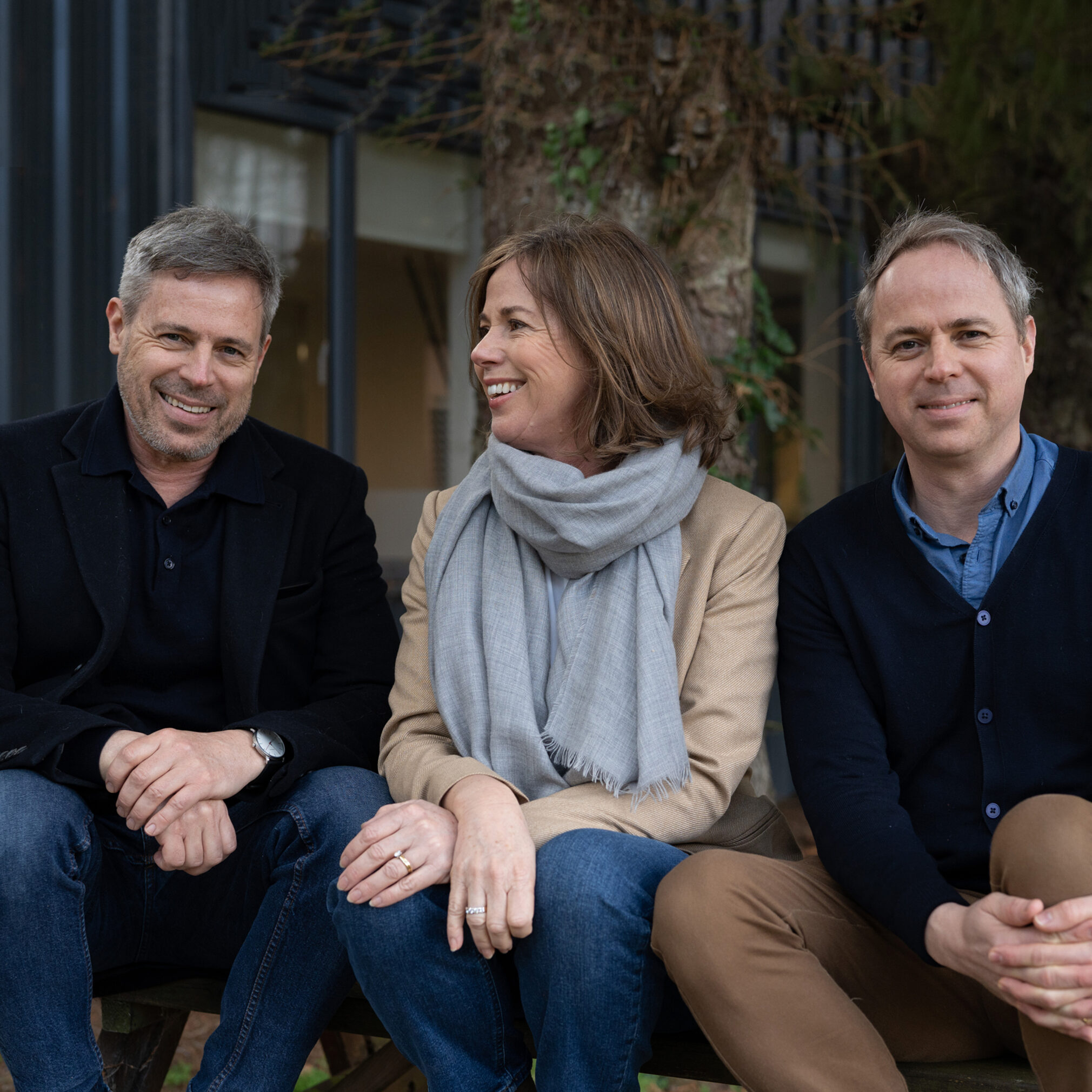
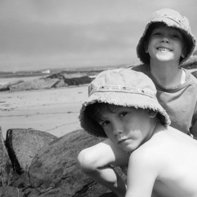
A key objective was to uncover the essence of Max Benjamin and what makes it special. Named after twins in the family, Max and Ben, we spent time with the family members, immersing ourselves in their world which allowed us to simplify and re-establish the brand narrative, helping them unearth and tell their story in a more visually coherent aesthetic and voice.
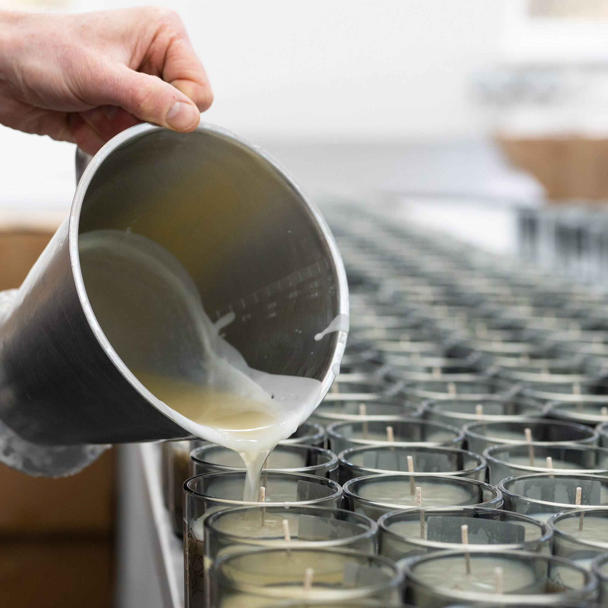
The Max Benjamin candles are meticulously hand-poured in their studio using 100% natural wax, with cotton wicks for a clean soot-free burn. The essential oils are selected by hand from artisan fragrance houses, using the purest of ingredients and its fragrances are inspired by their travels and the natural habitat on their doorstep. All key points of differentiation which we were keen to tap into.
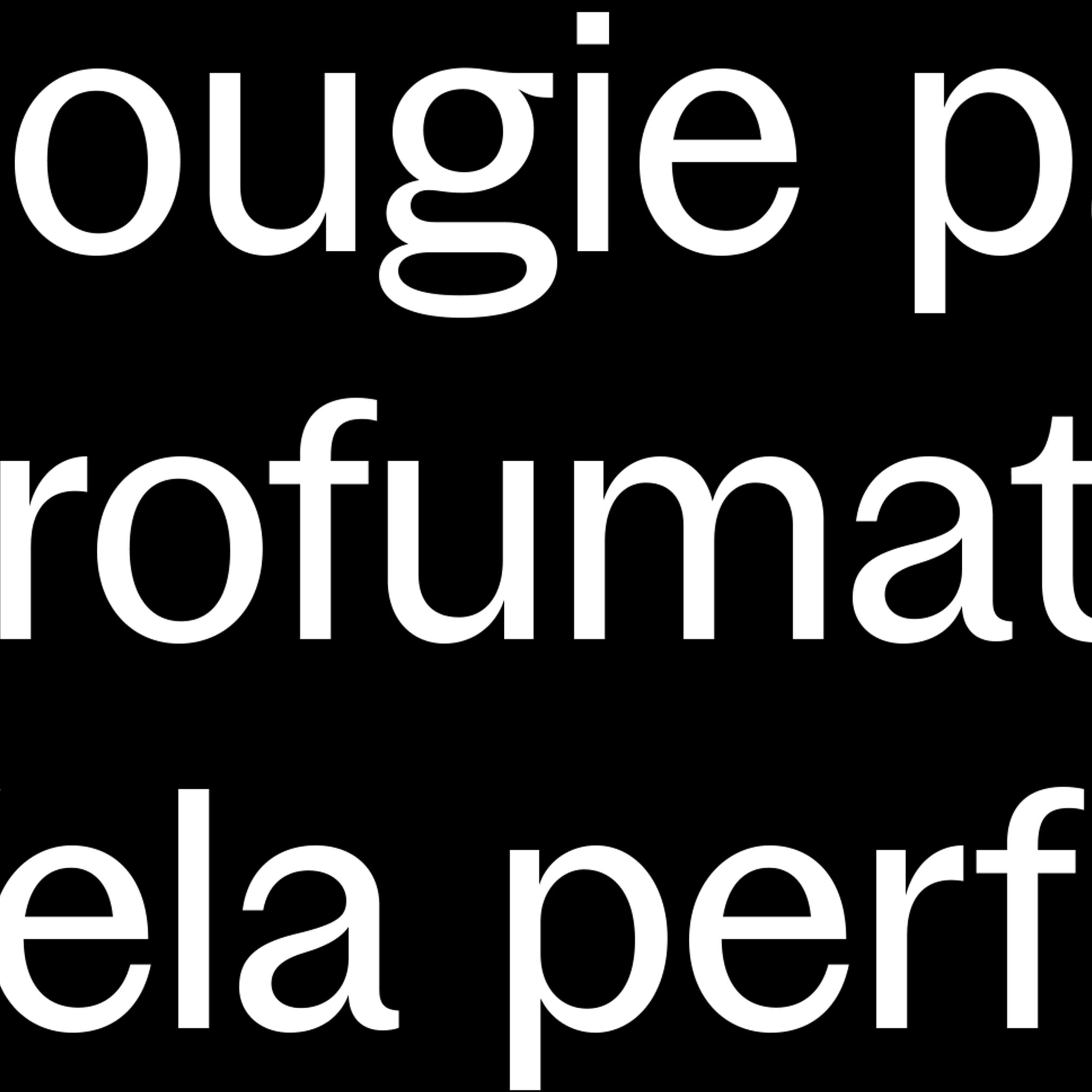
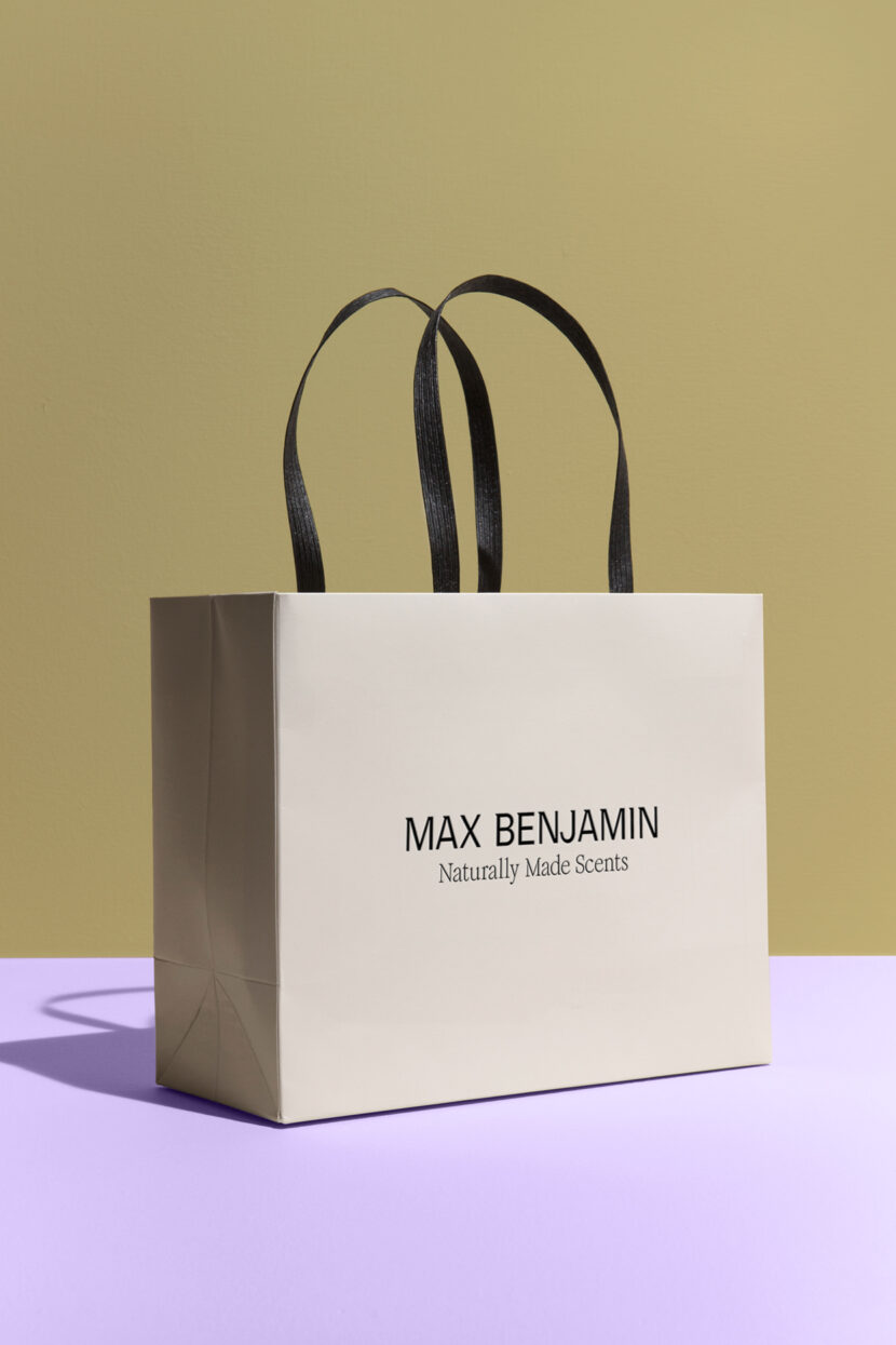
The brand identity centres around a new sans serif logotype with customised serif-like terminals, reminiscent of a candle flicker and a modern interpretation of the traditional Irish alphabet.
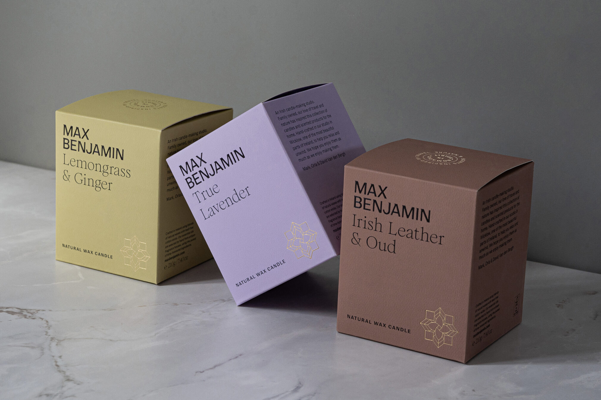
The brand had always been synonymous with colour, where each scent had its own distinct hue. This approach had successfully built loyalty, with customers often referring to a favourite fragrance by its corresponding colour. However, we recognised the need to refine the palette, to convey a more natural tone while ensuring they work cohesively as a range.
Bringing the story behind each scent to the fore was an important consideration, framing the brand's philosophy — uplifting everyday lives through the power of evocative scent. This serves as a compelling narrative that captures the essence of Max Benjamin in the tagline Life Uplifted.
A secondary serif display typeface is introduced and communicates the fragrance-related stories to great effect.
The brand motif features a stylised gorse flower, synonymous with this part of Wicklow. It is drawn in the style of European tiles, a tribute to the iconic apothecary in Florence which provides inspiration for its signature scent – Italian Apothecary.
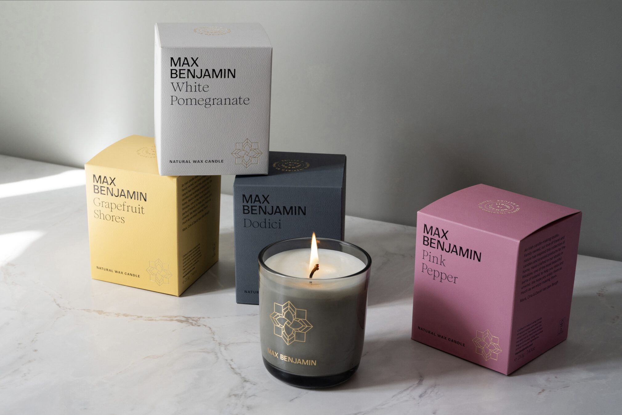
This simple design system seamlessly extends across the entire packaging range, encompassing candles, diffusers, refills, scented cards, car fragrances, soaps and lotions. The vessels for candles and diffusers also changed to a more distinctive smoked glass. A consistent visual language ensuring a cohesive and recognisable brand presence across these diverse items.
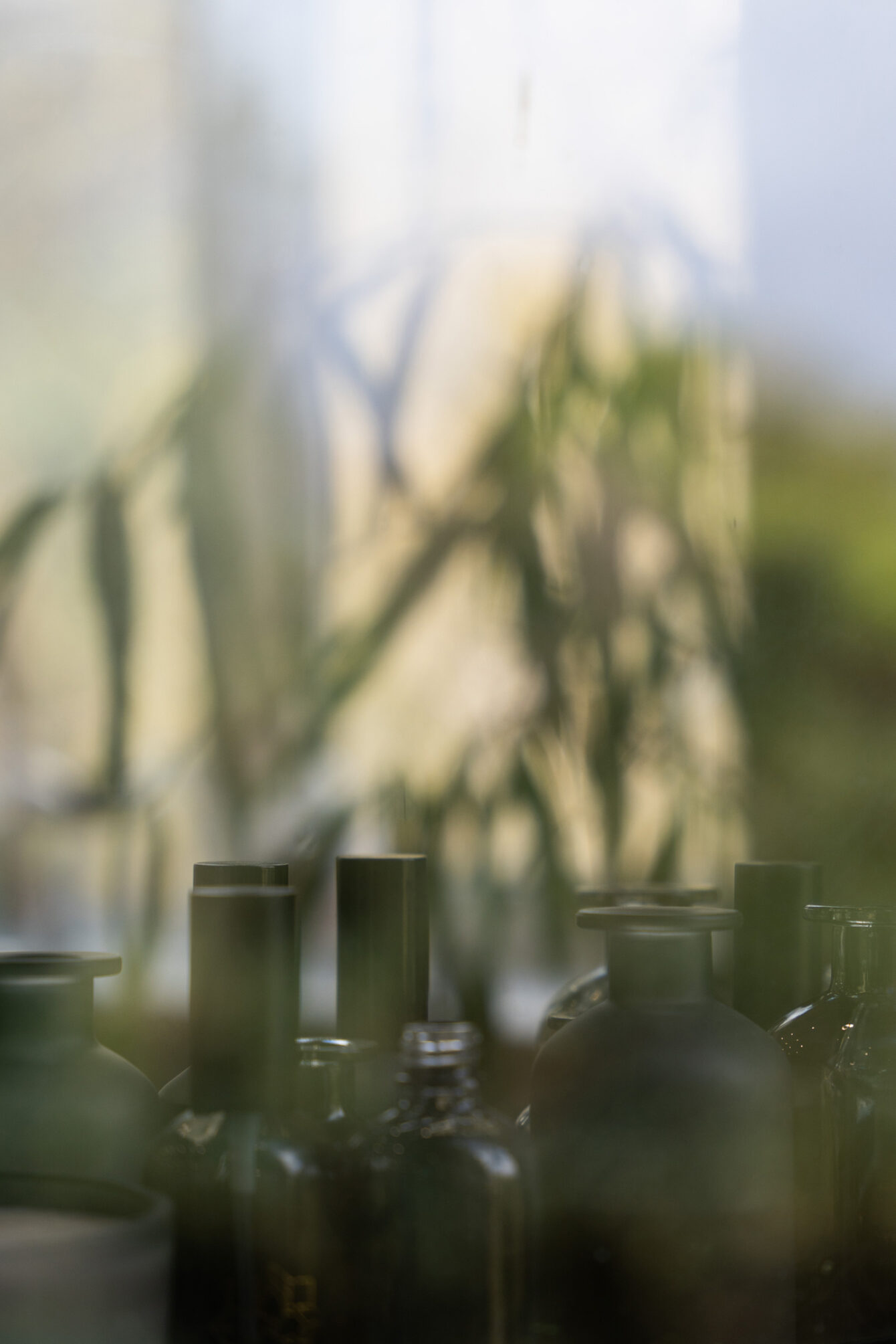
Working with photographer Ruth Connolly, a series of images were set up, and styled in-studio using natural light to authentically capture the essence of the brand and speak to both existing and newer audiences.
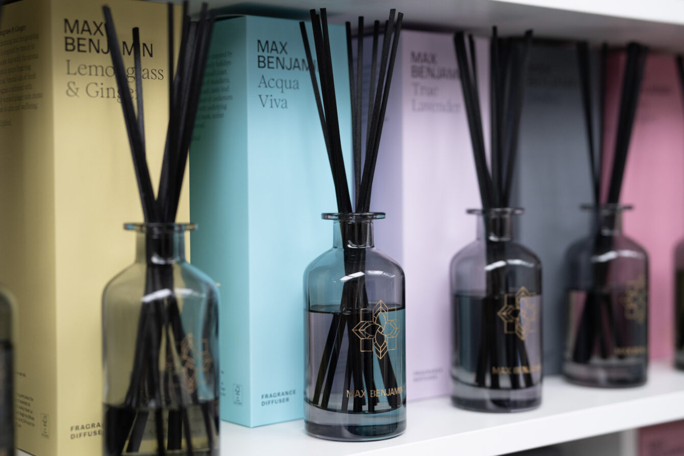
The new product range is available from select stores in Ireland and Europe, as well as from maxbenjamin.com
Embarking on our rebranding journey with CI Studio was one of the best decisions we have made over the years. With CI’s help, our brand has moved on to a new level. We have engaged with a younger demographic as well as copper fastening loyalty from our existing consumer base.
Mark Van den Bergh - Brand Director, Max Benjamin