The Reflector
An iconic building in Dublin's silicon docks
Property
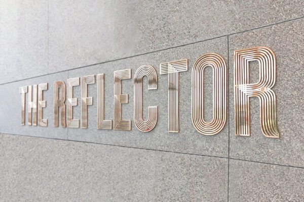
Property
Property
A unique and premium multi-tenancy office space, located in the heart of Dublin just off Stephen’s Green, 20 Kildare Street is a renovated Georgian terrace with a twist. Upon entering through the former Shelbourne Hotel Garage entrance, you are greeted with an impeccably designed reception, seamlessly connecting to contemporary offices at the rear through a modern light-filled atrium. The union of Georgian grandeur with striking architecture, has resulted in the creation of a truly iconic workspace.

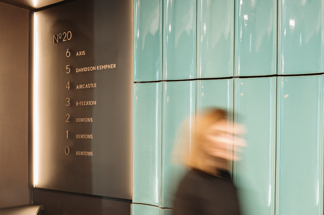
Having developed the brand identity with Kennedy Wilson in 2018, our relationship with them continued as they asked us to create the signage scheme. Working closely with the client design team, we adopted a holistic approach to the feature signage, finer details and wayfinding. This involved conceptualising, strategising, developing designs, and overseeing the manufacturing and installation process.

Drawing inspiration from the materials, tones, and rhythm employed by architects RKD within the building, we extended these elements to the signage and wayfinding. The oversized hand-rolled bronze numerals bring a sense of quiet luxury to the minimal monochrome lift lobbies.
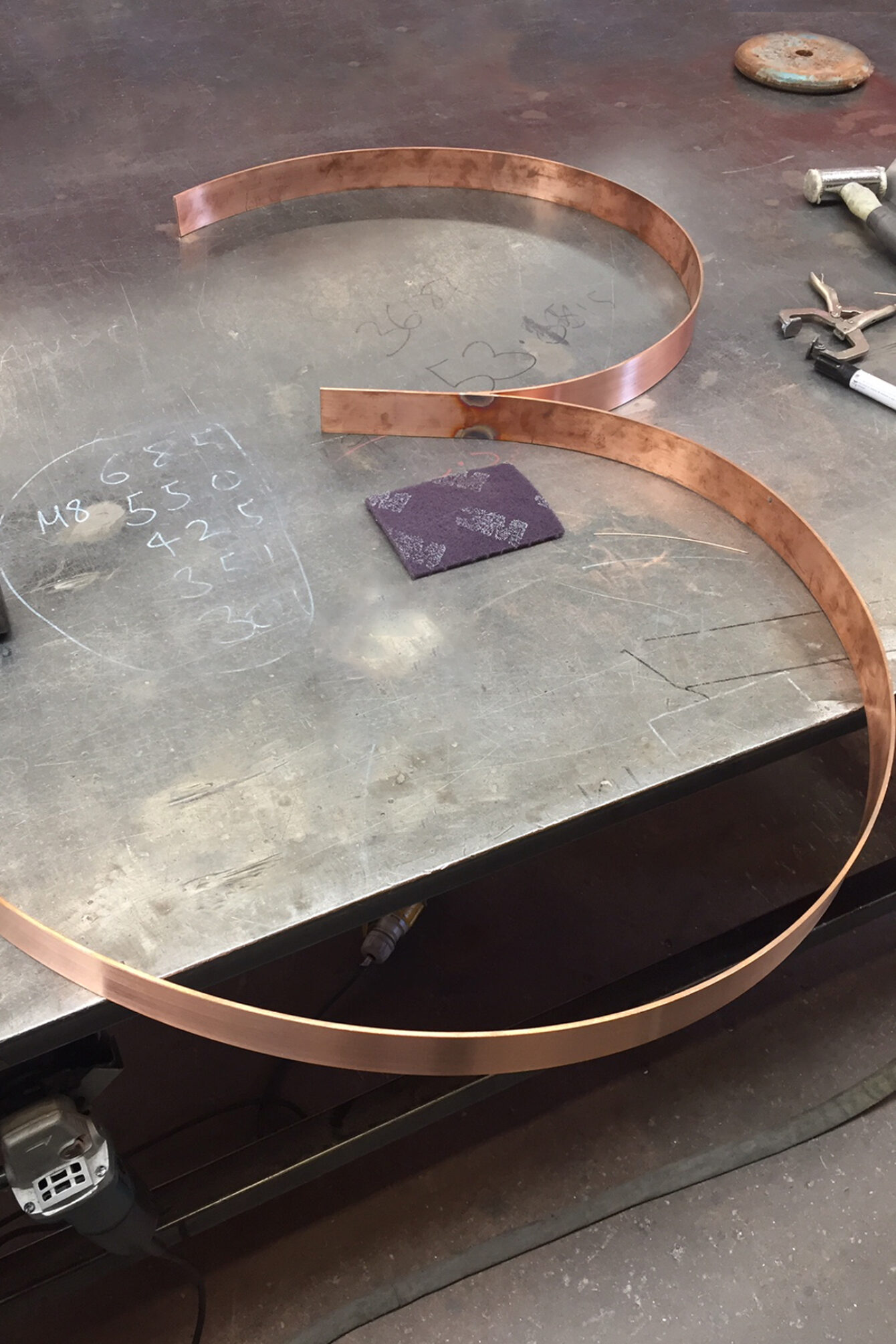

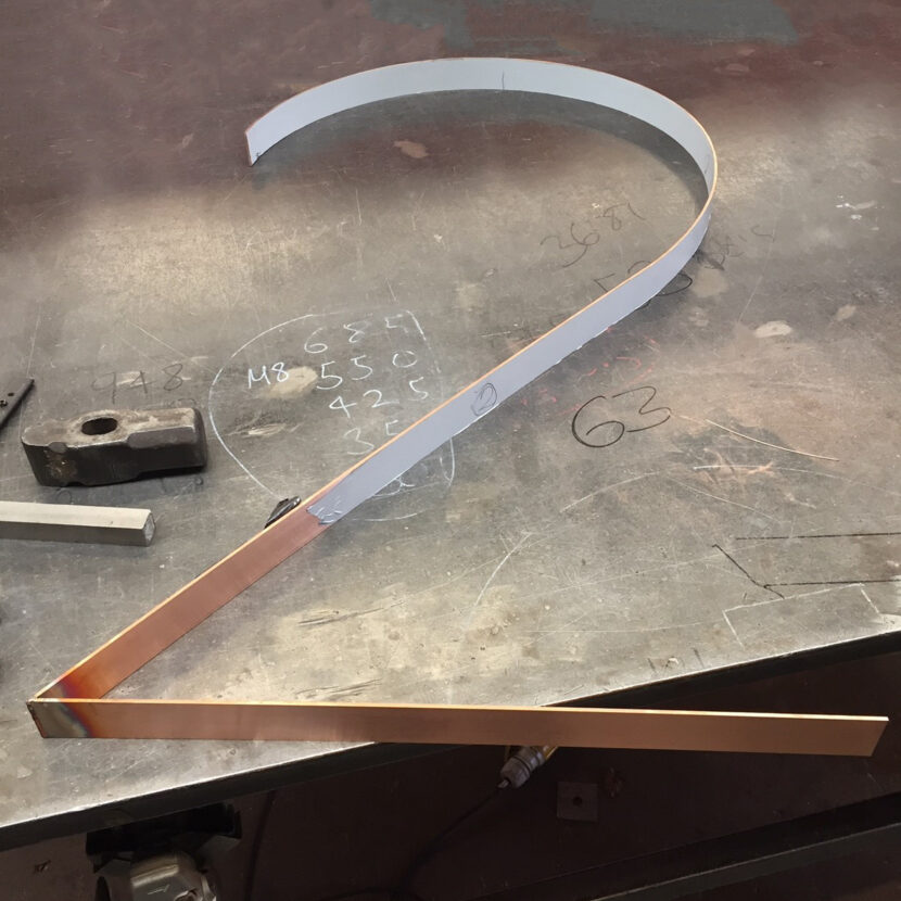
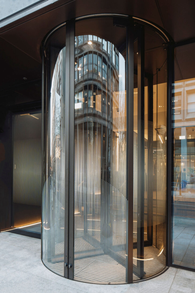
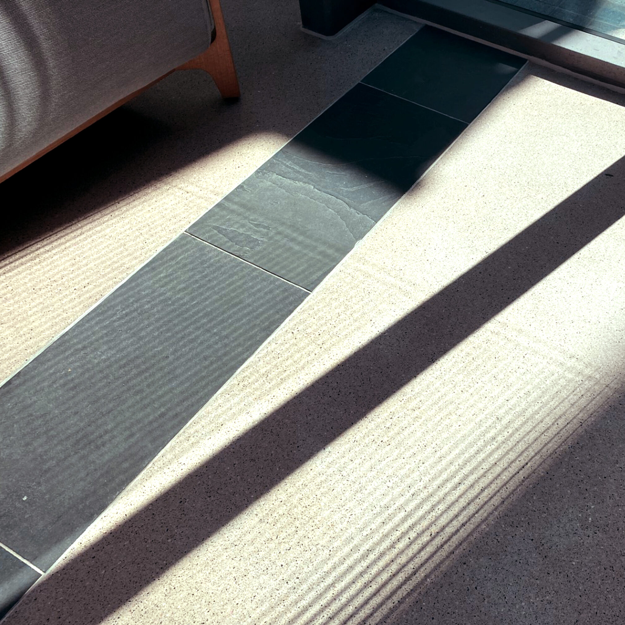
Regulatory safety decals on the doors and glass are necessary to maintain a connection from street level while also introducing a sense of privacy. Drawing inspiration from the distinct ribbed aqua tiles within the building, their vertical linear flow carries onto glass areas, creating a playful interplay of lines on doors when viewed up close, and a soft ethereal haze when observed from afar. On sunny days, they evolve to introduce an extra dimension, as minimal shadows are cast, creating a sublime tactile temporary pattern on floors and walls.

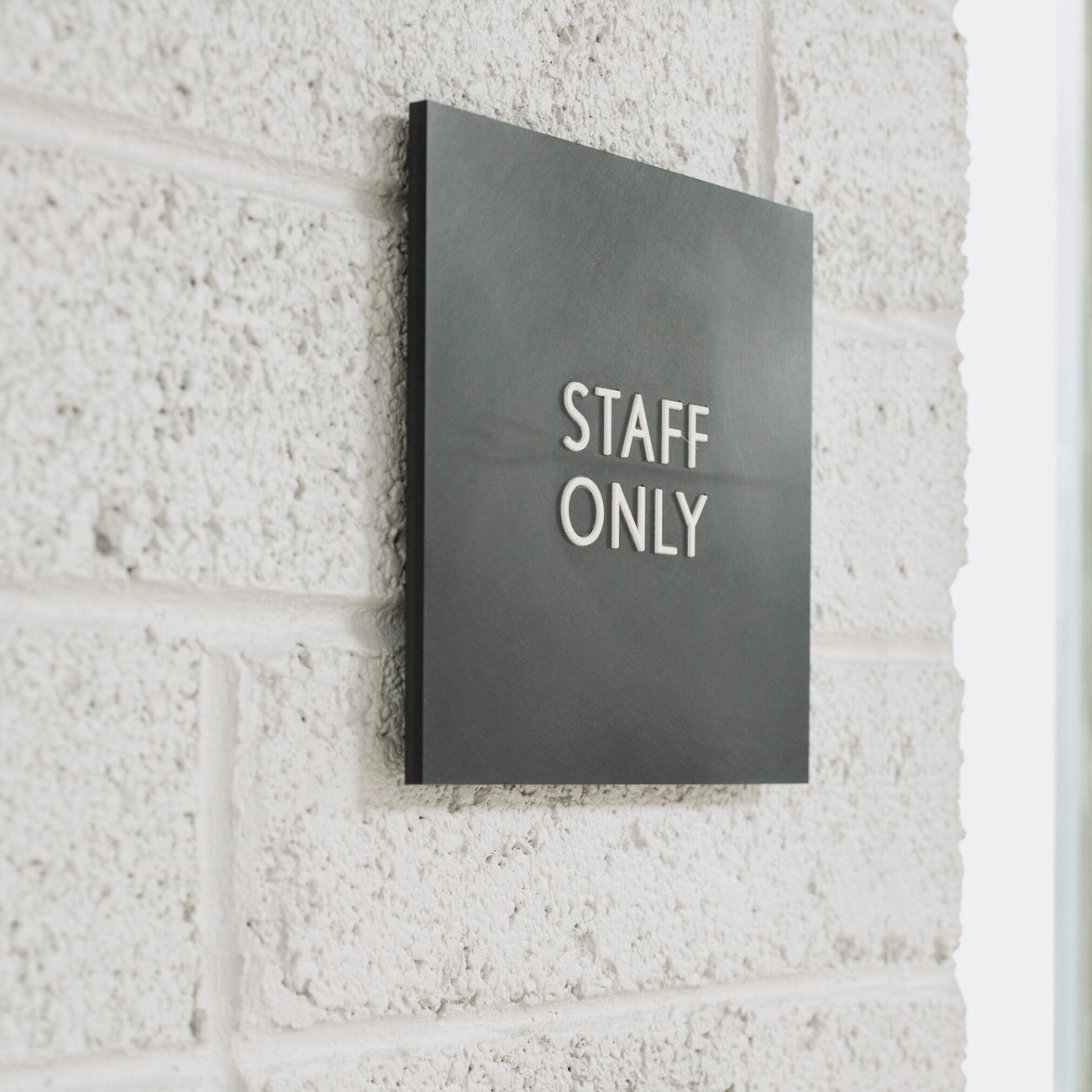
Understated Corian tactile wayfinding signs are seamlessly integrated into the interiors. Corian is one of materials within the interior palette, informing our choice, ensuring that the scheme becomes an integral part of the building fabric.
Working closely with our signage fabricator, we conducted extensive sample reviews, procuring prototypes to ensure that the design intent was realized. Additionally, we conducted snagging visits at the delivery stage, prior to client sign-off. The challenge was to maintain the high-end finish of the building within the signage scheme, allowing hero signs to stand out proudly and command attention, while blending wayfinding signs into the materiality of the space.