Tusla
Ireland's child & family agency
Public & NGO
Public & NGO
Public & NGO
Oaklee (formerly part of Choice Housing Group) is a housing provider which was established in 2001 with a strong social purpose; to deliver modern, high quality, homes for older people, families, mature singles and people with complex needs.
CI Studio were appointed to restructure and create a new brand identity for Oaklee, separate from Choice. To also position them apart from other social housing providers and create an identity which would better reflect their mission in society; enabling people to live, thrive and prosper.


As a consequence of the research undertaken, we renamed them Oaklee from Oaklee Housing, a small change that spoke volumes.
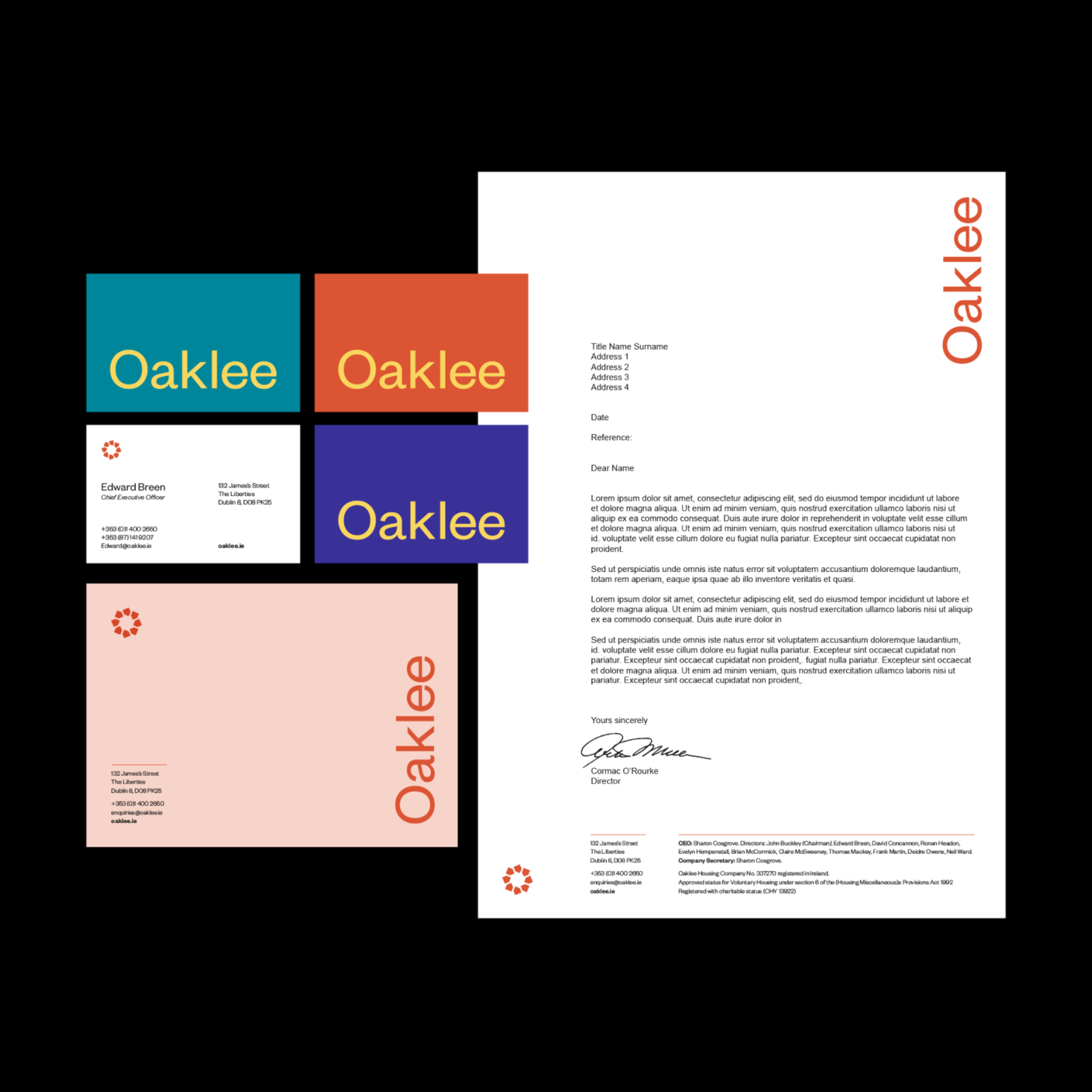
The Oaklee symbol is derived from a basic house shape repeated to create a community of homes forming a circle and teamed with a customised sans serif typeface for the wordmark.
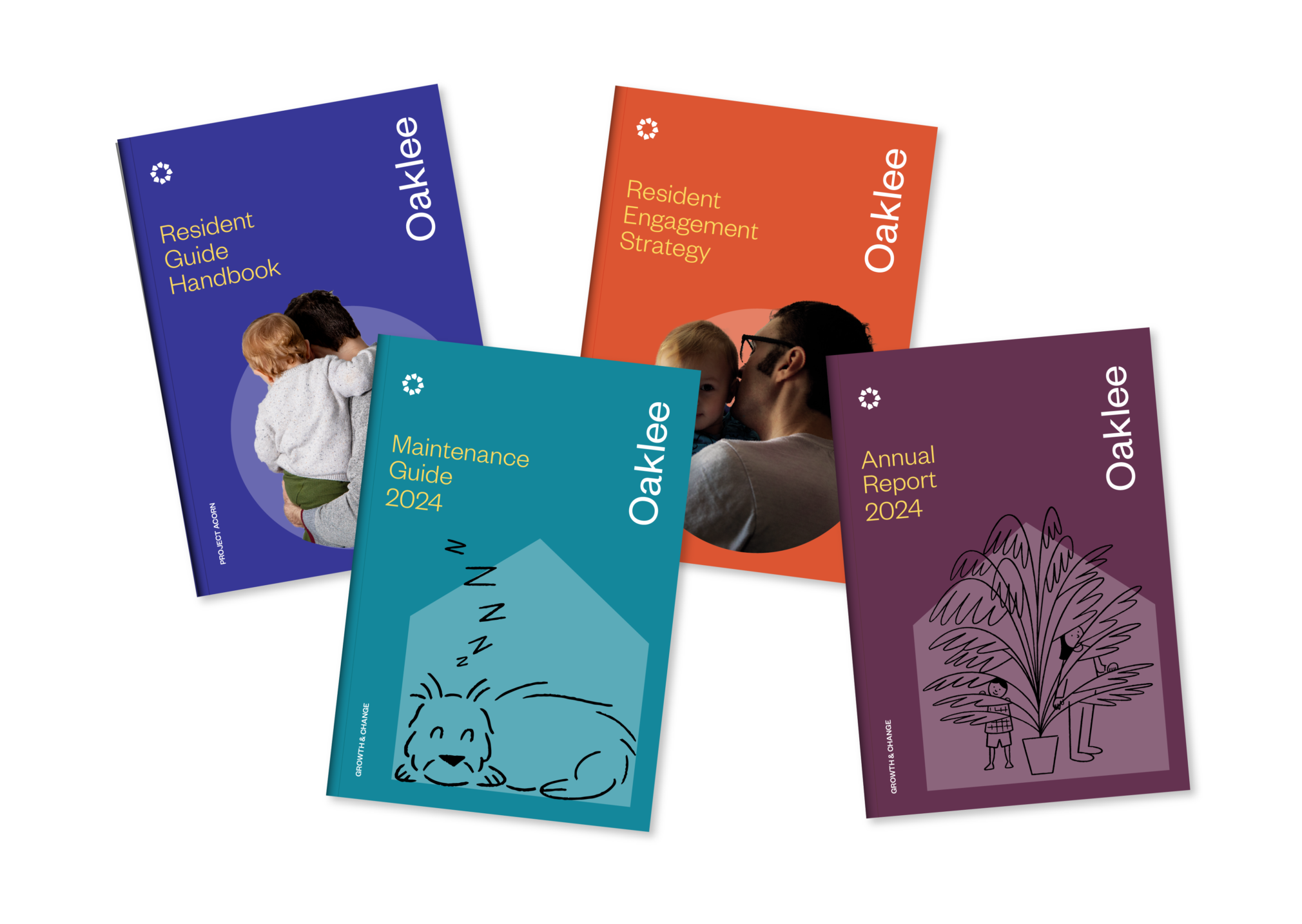
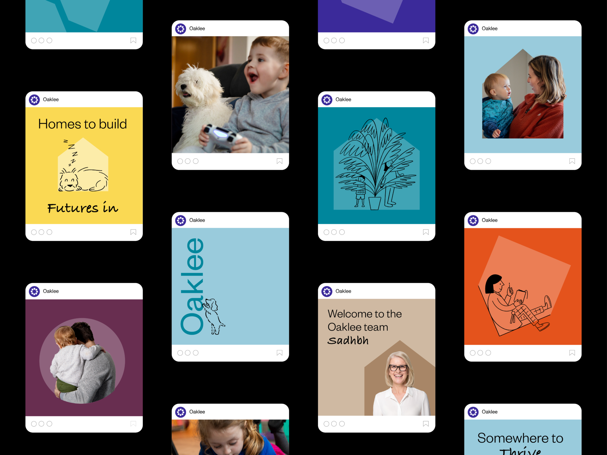
This shape along with the O of Oaklee is used throughout the visual system to contain imagery and illustration. The identity is complemented by a bright optimistic colour palette and a set of heart-warming illustrations, commissioned to perfectly capture the warmth and personality of the organisation and the work they do.
We created an image library of Oaklee tenants who allowed us to come into their homes and photograph them as they are, capturing the essence of what home means to them.
Our rebranding helped Oaklee to differentiate itself from other Irish social housing organisations and to reframe how they talk about affordable housing. An honest reflection of an organisation that truly cares about its tenants.
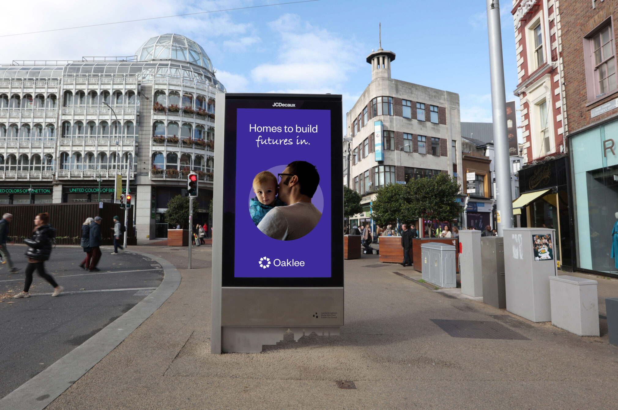
The project involved redesigning all communications from print to digital including the resident calendar for 2024 which was gifted to all Oaklee tenants as part of the brand launch.
Selected - 100 Archive 2023